Monday 29 December 2008

Bringing Type To Life

I've been thinking of my forgotten type project, and I thought it would be appropriate to present my work as a way of bringing the forgotten text back to life. I found alot of examples from a simple google image search (good old google).

This is called Tornado. The artist created large swirls of text outdoors in white so it looks like gusts of wind. It is appropriate that this sculpture was displayed outside as it's meant to be a tornado, and obviously they don't happen indoors.
Because it's white and the font is sans-serif it looks very clean and simplistic. I think it's very beautiful and if I was stood in front of it I think I would feel calmed by it


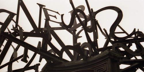
I adore this sculpture. It's very rough and gothic-looking. Its made from steel and it's pained in a rusty dark grey, so it has a cold, metalic feel. The text is bent and twisted and everything ends in points to give you an uncomfortable feel when you look at it.
Something like this would be appropriate to my project because the examples of forgotten type I found are all cold and hidden away. If I was to create a book or structure to display my work then using dark colours would be appropriate.

On the other hand, using bright colours and bold smooth fonts would be a way of rejuvinating type that has been forgotten.


I'm not sure how this one would have been made but I want to learn! It looks so fantastic, like the text is forcing its way through some cloth. It would look good against a wall so it appears to be growing out of the surface.

Tuesday 16 December 2008

Ripping My Hair Out!

For one of the units of my degree I had to create a website for a singer or band. I found this the most challenging project of the year so far, as I had no clue where to start. I chose one of my favourite artists, Ne-Yo, and decided to base the theme of the website on his new album Year Of The Gentleman.

With the release of this album, Ne-Yo has re-invented his image and his sound. The album has been reviewed as having a similar feeling to the Rat Pack and has 1950's vibes. Ne-Yo has altered his image and usually wears suits & hats.

Alot of his advertising and imagery is 50's themed. For example see his new television promo for the album here.

My Home Page

The colour scheme for my website is simple: black backgrounds and sepia tones for images. I've gone for soft colours instead of bold ones to give it an old-fashioned look. My research into 1950's advertising helped me greatly. I focused on advertising for media such as televisions and radios because the music industry needs them to advertise and get the artists/music out to their audience.

I've chosen to use sans-serif bold fonts for my site because these are the fonts that were popular in 1950's advertising. Also, most of Ne-Yo's logos and CD covers used fonts similar to the ones I chose for my website because they suit the feel of his music.

My Shop Page
My shop page is slightly different. I've kept the navigation in the same position so that the site is easy to get around. On every page Ne-Yo's logo is in the same position so that there is some coherence within the site. I used a purely black background so that the images of Ne-Yo's CD's stand out more, as they are colourful.

My Tour Page
When you hover the mouse over the televisions to navigate through the site, the screens glow a faded blue colour. This is to give the appearance of static on the screen and to make the link stand out by giving it some colour. I chose blue because it is calming, and the rest of the site is softly coloured.

Thursday 11 December 2008

More on Type


My Neglected Typography has grown! I've been out taking more photos, as you can see;

Thursday 27 November 2008

I'm Back Baby!

I haven't had access to blogger for a while because someone tried to steal my email address (grrr) but I'm back online now & there's lots to catch up on!

ROBERT NAKATA
A project called Irreverence Justified by Robert Nakata has caught my eye. It's a book designed for Nike which has achieved near mythical status, with numerous questions asked about and it yet very few answers known.


The brief: Nike EHQ wanted to acknowledge and thank their various cultural and business partners with the coming of the New Millenium in the form of a gift.

Why it was made: Nike EHQ were re-issuing 12 classic shoes for the New Millenium and they wanted to communicate this in some at-the-time undetermined form. Each re-issue would be released monthly during 2000 and each shoe had to somehow be featured.


Inspiration: Nike’s initial suggestion, given the one re-issued shoe per month, was a calendar. Other ideas included re-running all the Nike television spots made up to that point somewhere in the world 24/7 on New Year’s Eve. Ultimately they needed a gift to hand out and since it was all about the shoes. The photography of the shoes for the book came from a variety of sources. The 12 re-issues, the Michael Johnson Gold Olympic shoes and a few others were shot originally for IJ by Hans Pieterse. Most of the images came from old scans and, with the really old shoes, scans from old catalogues and/or print ads were made as Nike no longer had the original shoes.

These posters are some more of Robert Nakata's work. I love the shapes that he creates with image and text. For example, the fluid shape above with the words "holland festival" sat on the image. He makes the text part of the image. Below you can make out the letters that spell "Holland" anchored within the image. You have to use your imagination a bit but they are there.
I like the use of colour too. The colours are strong but there's only 4 colours: blue, red, green and orange (and black & white of course).

Friday 14 November 2008

Examples!

When I was doing research for a montage project I discovered a few interesting things......


This is the contents page of the book. I like the unusual use of direction. The main chapter titles being in bold make it work. If they werent bold then it would be too hard to read, but as it is it's easy to follow.

I can't remember who did this, but it really caught my eye. A montage within type is a great idea. It's so simple I don't know why more people don't do it (including myself).

Netted

Tuesday 4 November 2008

Forgotten

I mentioned in an earlier blog a project I've been set about typography that gets neglected in some way. I've chosen to base my work around typography we know exists, but we easily forget about or take for granted.

For example, the numbers on a gas meter. How often do you think about them? Do you forget they are there? When was the last time you read the numbers/instructions/ warnings around yours?


Here are some things I found interesting when I had a probe around my house & the streets. Some will be starting points for making my final project.

When I took the back off my mobile phone to look at the battery, I noticed this on the inside cover. I've had my phone for 2 years and never noticed this before.

I had a peep in between my cooker and kitchen cupboard, and noticed this. I thought it said "Ass" at first, then realised it was "Gas". Oops!

I love the type on this drainpipe. It's dead straight and the font is very industrial.

These marks are all over the streets but I can't say I've ever really noticed them until I started looking for them.

This is a pipe that caught my eye behind my washing machine. To me, the text is just gibberish, but to somebody it will mean something.

Most people throw their receipts away without looking at them. Also, there's a lot of different things written on them but we tend to ignore most of it and just look at the price or the items.

One of my favourites; an arrow or triangle with the number 13 spray painted onto the pavement. I like the colour and also it doesn't point to anything visible, it's just there.

More to come on the development on this project!

Tuesday 28 October 2008

My Little Hobby......

Since I can remember I always kept a notebook on my bedside table. This is because I get my best ideas for stories, graphics, animation etc in my sleep. One day I didn't have a notebook next to my bed but couldn't be bothered to get up, so I wrote in the book I was reading at the time, To Kill A Mockingbird.

I've since carried on using literature as notebooks for my sketches and ideas, for these reasons:
  • I have two huge passions. The first is reading, which I've loved my whole life. I especially like the classics (I read Charles Dickens' Tale Of Two Cities at age 11 - and yes I know I was a geek!). I studied English last year at Lincoln University but found I wouldn't be happy turning my love of literature into a career. I still read all the time, and always have a book on the go.
  • My second passion is sketching. I'm always drawing, especially people and fantasy art. After having my portfolio of 60+ illustrations stolen last year by a fellow student, every sketch I do is extremely precious to me, and I'm determined to build up a bigger and better portfolio.
  • In using literature as my canvas I am combining my two hobbies and making work that's unique and says something about who I am.

I started scribbling all over To Kill A Mockingbird in 2001, and have since demolished 3 more books. I haven't sketched on every page, just the first one I open which makes it more interesting.

My first book started as a sort of dream diary of ideas but now I've gone into experimenting with using the pages as they are and re-shaping them. For example, on some pages i tear out a line of words so you can read a line on the page behind it. This can be confusing and quite funny.

I have posted pictures of my first "notebook" below, and will post other ones in the future.


X & Y


I recently bought a copy of an old Coldplay album, X&Y and the cover really caught my eye. The front of the album is all black, with coloured blocks stacked up in a neat pattern (below).


There are a lot of people who don't like the fact the type isn't readable, but I love it. It's very appropriate to the album too. The album has a futuristic sound, and I think the type face that was designed for the album was the creators interpretation of the way type might evolve in the future. The rest of the cover follows the theme as all images are framed in blocks and are of the colours used in the typeface (exapmles below).


The album’s cryptic cover art was designed by Tappin Gofton (aka Mark Tappin and Simon Gofton), who created the cover for The Chemical Brothers’, Push the Button. The blocks are the Baudot code-encoding (ITA2, a 5-bit alphanumeric encoding used by telegraphs) of the title of the album, X&Y.


The final page of the booklet (seen below) contains the slogan “Make Trade Fair”, using the same encoded alphabet. Holding this at an APEC protest will really hit hard to all the Coldplay fans at the summit
Above: "make trade fair"


The CD booklet contains the ITA2-encoded alphabet. Amazingly, I found possibly the best generator on the web! The Coldplay X & Y text generator. CLICK HERE to make your own words and phrases using this font.
Here are some of my experiments I thought were interesting:


The alphabet, letters A-P with spaces inbetween (above) and Q-Z (below)

The whole alphabet (below) with no spaces between each letter. I like this because it reminds me of sound waves and also I can see the word "RAVE" spelt out.


Below is the word "colour". This creates an interesting shape. The "letters" here are very similar so lines of colour are created instead of square blocks. Speaking of colour, I like the way certain colours are used only in certain lines. E.g. the bottom row of blocks is always blue, the one above green & purple, the row under the dotted line is all red and above the dotted line there is no colour at all, only black, grey and white.

The image below is the word "typo". This shape reminds me of a microscope. This word creates a line from top left to bottom right. You are directed down to the bottom where the largest block of colour is. Each letter, word or phrase looks amazing in different ways.


I've been trying to think of possible reasons why the blocks are separated by the red dotted line, and the above side is colourless while the bottom side coulourful. I think perhaps this is to do with the theme X & Y. "X" might be one side of the line e.g. the top, and "Y" might be the bottom.
We commonly use X and Y as letters used in place of names for anonymous people or unknown quantities. For example, in maths problems you often get if Mr X has 12 apples, and Mr Y has 5 etc.... Or if we are talking about people we might name someone "subject X" for example. Also the chromosomes of the body are named X and Y. These may have significance, but as of yet I'm stuck in how to fully analyse the font and the Coldplay album cover. (if lightbulbs start going off in my head I will post on the blog!)


I like the shapes generated for my name, as it's given me a colourful identity. I'm not really keen on the shape created for my full name though, as I can't see any letters or images formed in there.The word "design" (below) is one of my favourites because it looks like a man dancing or walking. But because the top two rows of blocks are long it makes me think he looks like he's slouching, so is perhaps shuffling along. And if I imagine it is someonw shuffling, for some reason I picture an old man.
I find this very interesting as my mind/imagination has created an image out of squares of colour. This may be something for me to experiment with in the future (I've said it before - keep checking my blog - you know you want to!).

The word "puppy" below actually does look like a puppy. I found this hilarious and also makes me miss my puppy, who I havem't seen since I came to university :(


TRY OUT THE COLDPLAY TEXT GENERATOR NOW!!
 
Custom Search