 This is called Tornado. The artist created large swirls of text outdoors in white so it looks like gusts of wind. It is appropriate that this sculpture was displayed outside as it's meant to be a tornado, and obviously they don't happen indoors.
Because it's white and the font is sans-serif it looks very clean and simplistic. I think it's very beautiful and if I was stood in front of it I think I would feel calmed by it

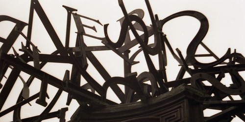
 I adore this sculpture. It's very rough and gothic-looking. Its made from steel and it's pained in a rusty dark grey, so it has a cold, metalic feel. The text is bent and twisted and everything ends in points to give you an uncomfortable feel when you look at it.
Something like this would be appropriate to my project because the examples of forgotten type I found are all cold and hidden away. If I was to create a book or structure to display my work then using dark colours would be appropriate.
On the other hand, using bright colours and bold smooth fonts would be a way of rejuvinating type that has been forgotten.


 I'm not sure how this one would have been made but I want to learn! It looks so fantastic, like the text is forcing its way through some cloth. It would look good against a wall so it appears to be growing out of the surface.

No comments:
Post a Comment