Tuesday 28 October 2008

My Little Hobby......

Since I can remember I always kept a notebook on my bedside table. This is because I get my best ideas for stories, graphics, animation etc in my sleep. One day I didn't have a notebook next to my bed but couldn't be bothered to get up, so I wrote in the book I was reading at the time, To Kill A Mockingbird.

I've since carried on using literature as notebooks for my sketches and ideas, for these reasons:
  • I have two huge passions. The first is reading, which I've loved my whole life. I especially like the classics (I read Charles Dickens' Tale Of Two Cities at age 11 - and yes I know I was a geek!). I studied English last year at Lincoln University but found I wouldn't be happy turning my love of literature into a career. I still read all the time, and always have a book on the go.
  • My second passion is sketching. I'm always drawing, especially people and fantasy art. After having my portfolio of 60+ illustrations stolen last year by a fellow student, every sketch I do is extremely precious to me, and I'm determined to build up a bigger and better portfolio.
  • In using literature as my canvas I am combining my two hobbies and making work that's unique and says something about who I am.

I started scribbling all over To Kill A Mockingbird in 2001, and have since demolished 3 more books. I haven't sketched on every page, just the first one I open which makes it more interesting.

My first book started as a sort of dream diary of ideas but now I've gone into experimenting with using the pages as they are and re-shaping them. For example, on some pages i tear out a line of words so you can read a line on the page behind it. This can be confusing and quite funny.

I have posted pictures of my first "notebook" below, and will post other ones in the future.


X & Y


I recently bought a copy of an old Coldplay album, X&Y and the cover really caught my eye. The front of the album is all black, with coloured blocks stacked up in a neat pattern (below).


There are a lot of people who don't like the fact the type isn't readable, but I love it. It's very appropriate to the album too. The album has a futuristic sound, and I think the type face that was designed for the album was the creators interpretation of the way type might evolve in the future. The rest of the cover follows the theme as all images are framed in blocks and are of the colours used in the typeface (exapmles below).


The album’s cryptic cover art was designed by Tappin Gofton (aka Mark Tappin and Simon Gofton), who created the cover for The Chemical Brothers’, Push the Button. The blocks are the Baudot code-encoding (ITA2, a 5-bit alphanumeric encoding used by telegraphs) of the title of the album, X&Y.


The final page of the booklet (seen below) contains the slogan “Make Trade Fair”, using the same encoded alphabet. Holding this at an APEC protest will really hit hard to all the Coldplay fans at the summit
Above: "make trade fair"


The CD booklet contains the ITA2-encoded alphabet. Amazingly, I found possibly the best generator on the web! The Coldplay X & Y text generator. CLICK HERE to make your own words and phrases using this font.
Here are some of my experiments I thought were interesting:


The alphabet, letters A-P with spaces inbetween (above) and Q-Z (below)

The whole alphabet (below) with no spaces between each letter. I like this because it reminds me of sound waves and also I can see the word "RAVE" spelt out.


Below is the word "colour". This creates an interesting shape. The "letters" here are very similar so lines of colour are created instead of square blocks. Speaking of colour, I like the way certain colours are used only in certain lines. E.g. the bottom row of blocks is always blue, the one above green & purple, the row under the dotted line is all red and above the dotted line there is no colour at all, only black, grey and white.

The image below is the word "typo". This shape reminds me of a microscope. This word creates a line from top left to bottom right. You are directed down to the bottom where the largest block of colour is. Each letter, word or phrase looks amazing in different ways.


I've been trying to think of possible reasons why the blocks are separated by the red dotted line, and the above side is colourless while the bottom side coulourful. I think perhaps this is to do with the theme X & Y. "X" might be one side of the line e.g. the top, and "Y" might be the bottom.
We commonly use X and Y as letters used in place of names for anonymous people or unknown quantities. For example, in maths problems you often get if Mr X has 12 apples, and Mr Y has 5 etc.... Or if we are talking about people we might name someone "subject X" for example. Also the chromosomes of the body are named X and Y. These may have significance, but as of yet I'm stuck in how to fully analyse the font and the Coldplay album cover. (if lightbulbs start going off in my head I will post on the blog!)


I like the shapes generated for my name, as it's given me a colourful identity. I'm not really keen on the shape created for my full name though, as I can't see any letters or images formed in there.The word "design" (below) is one of my favourites because it looks like a man dancing or walking. But because the top two rows of blocks are long it makes me think he looks like he's slouching, so is perhaps shuffling along. And if I imagine it is someonw shuffling, for some reason I picture an old man.
I find this very interesting as my mind/imagination has created an image out of squares of colour. This may be something for me to experiment with in the future (I've said it before - keep checking my blog - you know you want to!).

The word "puppy" below actually does look like a puppy. I found this hilarious and also makes me miss my puppy, who I havem't seen since I came to university :(


TRY OUT THE COLDPLAY TEXT GENERATOR NOW!!

Monday 27 October 2008

Typography In The City

I'm doing a project for the Typography unit of my degree about typography easily missed in the landscape. The brief is to take photographs around Lincoln of typographical elements people don't usually notice. This can be very abstract or signage (these are just examples).

The first thing I did is research. Here are some interesting images I found on the web:


These are photographs someone took on a trip to Dubai. I particularly like the neon green one in the second row down, on the right. I don't understand the language so don't know what this symbol means, but to me it is very beautiful. There is something interesting in the symmetry of the shape, and the bright colour on a black background draws me into it.

Thursday 23 October 2008

Spiderpig, Spiderpig....

I'm going to analyse the Spiderman titles in more detail because these really impress me.

Typography:


The typography used in the Spiderman 2 trailer is appropriate to the film. The font is sharp and straight, not curved. This is like the lines created in a spider's web. It also reminds me of the scientific part of the story because if you think of a text that suits science & technology it would be straight and simple, not thin and curly for example.


The text is sometimes broken in the frame, as you can see below. The frame is divided by black lines that look like a web. The text looks like it's prey caught in the web. Also, the spiderman movies get darker the further into the series we go, and breaking up the text represents the darker side of the villains and heroes. Things are getting more complicated for spiderman, and in film 2 he could be described in a few ways a broken man (e.g. in his relationship).


Colour:
The colours used are black, white, red and blue (except for images). This is because red and blue are Spiderman's colours (he wears them on his suit). The red is used more as it could be symbolic of the love story within the film and also red signifies danger. White isused mainly for text as it stands out against red and blue, but also because it creates negative space which makes the text a part of the image, and doesn't over complicate the colour use. Black is used for some text and all the lines (webs). It's dark and represents the spiders.


Themes:
There are themes of the film depicted in the titles. Firstly, there are lots of comic book style images, which link to the basis of the films. Because it's not real footage from the films it gives the titles a more surreal effect, and also sums up the events that happened previously. Secondly, The spiders have been used alot, for example in the picture below. Mary Jane's hair is standing up and putting this is black and white makes it more eerie, like an old horror film. Lots ob black lines are used to break up almost every frame, like a cobweb.

Tuesday 21 October 2008

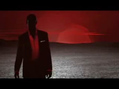
Coke Zero Meets Bond

The new Coke Zero advert is also promoting the latest 007 film, Quantum of Solace. It mimics the title sequences we all recognise as Bond.

Watch the commercial here


What I Like About It:
  • Colour - Simple colour scheme of black, white and red (red being the colour Coca Cola use for their brand). Red is a colour that signifies passion & danger, two things suitable to the Bond films.
  • Editing - A bottle of Coke Zero flies towards te screen and then we see the fizz bubbles of the Coke and silhouettes of women swimming in it. This transitions smoothly into a car chase scene. Very suave, smooth and impressive graphically.

  • Shape - Interesting use of shapes. Women's curves used next to the curves of a Coke bottle. Makes the drink seem sexy (if it's possible for a bottle of coke to be sexy). About 45 seconds into the commercial there are sots were you only see parts of people e.g. a woman's legs, a man's head and shoulders. Leaves their identity secret. Also is interesting as there are lots of figures on screen at the same time, all doing different things. You focus on different tings every time.

Monday 20 October 2008

The Name's Bond.....

Daniel Kleinman

I'm featuring Kleinman in this blog because he is responsible for the title sequences of the 5 latest Bond films, including Casino Royale, my own favourite sequence.

Watch the sequence here.

There are some deviations from the 007 series' iconography in Casino Royale 2007 which have caused many talking points. This sequence is very different from the other bond's but comlpletely appropriate to the film. Also, since this is a modern re-vamp of the original Casino Royale film it's fitting that the title sequence should mark this by being a bit different, and a bit more modern.

In an interview on his overhaul of the Bond films, Kleinman said: "Everybody agreed the idea of using images of the iconic silhouetted dancing girls in the titles was not appropriate. In this film, Double-O is not totally formed as the James Bond everybody knows - the womanizing, slightly un-PC character."

The Casino Royale sequence you can see in cinemas wasn't Kelinman's original idea. He spent some time developing titles which were similar to all the other Bond films, but the pre-title scenes of the film include an intense chase scene which would have been too similar to Kleinman's first design. He wanted to make the titles stand out and be remembered. I certainly remembered them when I left the cinema.


Kleinman went and bought a first edition copy of Ian Fleming's 1953 novel and on the cover saw a design of a playing card bordered by eight red hearts dripping blood.

"The hearts not only represent cards but the tribulations of Bond's love story," Kleinman says. "So I took that as inspiration to use playing card graphics in different ways in the titles," like a club representing a puff of gun smoke, and slashed arteries spurting thousands of tiny hearts.
Then he cut out the actors' silhouettes and incorporated them into about 20 digitally animated scenes depicting intricate and innovative card patterns that play for 3 1/2 minutes.

Seen in historic context with title designs that precede his, Kleinman says "Casino Royale's" credit sequence owes more to the jagged emblematic graphics of Saul Bass than to the cheeky erotica of Maurice Binder, who designed 14 Bond titles in all.

"I can't get too psychological with it because it is a title sequence," he says. "But it must be more than a flow of meaningless images." And there's some good news for the crew. "By the end of this one, 007 is more like the Bond we all know and love," says Kleinman, who is onboard to design the credit sequence for the next installment. "So I think those dancing girls may well come back again."


Read an interview with Kleinman on his overhaul of the Bond sequences HERE

Sunday 19 October 2008

Kyle Cooper Trivia

Here are some facts you might not know about Kyle Cooper:

  • Cooper was inspired for the Spiderman titles by a black widow spider he found in his house. e kept the spider in a tank in his shed and it had LOTS of babies. Cooper used these spiders to photograph and model for the title sequences.
  • Cooper has designed over 150 feature film's titles
  • Cooper is a native of Swampscott, Massachusetts and holds a M.F.A. in Graphic Design from Yale University School of Design and a B.F.A. in Interior Architecture from University of Massachusetts at Amherst.
  • Cooper's former production company, Imaginary Forces, takes its name from a line in the prologue of William Shakespeare's 'King Henry the Fifth': "And let us, ciphers to this great accompt, On your imaginary forces work." The decision to take the name of the company from this prologue is based on the idea that opening titles/credits (Cooper's main area of expertise) often act like a prologue to a film.
  • Claims his greatest influence in his choice of profession (i.e. title designer) is Stephen Frankfurt's opening title sequence for To Kill a Mockingbird (1962).

Friday 17 October 2008

Title Sequences

Here are links to what I think are some of the best movie title sequences & what makes them so great.

Kyle Cooper:

Kiss Kiss Bange Bang
Opens with a silhoutte of a man running. Never cuts away, the shot always follows him. Views of city buildings. Gives away themes and settings, an introduction to the film. Next part of the sequence is a red background with silhouttes of women in seductive poses and a gun. The gun fires and out of it grows branches with leaves. Quite a contrast between guns and a blood-red background & foliage moving smoothly and delicately. Any red used (eg. the bridges 1 min in on the video) isn't clean. It looks scratched, smudged. Silhouettes used to create mystery, anonymity. One of the silhouette people gets killed by another at the "party" full of anonymous outlines. Idea you don't know who could be a killer, people's secrets, dark sides.....

Spiderman 2
Spiderman 3
Spiderman - The Marvel "flip book" came from Cooper and is now used in most Marvel films. Cooper was inspired by his own "pet" spiders for the sequences. Have an eerie feeling. When I saw both 2 and 3 at the cinema I remembered the title credits as being fantastic. 3 serves as a part of the film, summarising the previous two movies in style, through things like broken mirrors and cobwebs. The titles from 2 use cobwebs to disect the frame. The style of 2 is more like a comic book, with illustrations of the characters and previous scenes.


Wild Wild West
Mimic - Much the same style as SE7EN. Very gritty, edgy. Makes the audience feel uncomfortable. The editing isn't smooth, it's jumpy and the cuts are very sharp. Sometimes the screen appears to move and shake. Alot of the text is blurry or smudged. Text looks like it's been typewritten, which reminds me of case reports from crime scenes. This is also the same effect you get from the use of alot of still & negative imagery.

Daniel Kleinman:

Casino Royale

Thursday 16 October 2008

Kyle Cooper


Kyle Cooper is well known for making title-sequence for films. Some Cooper titles you might recognise are; Se7en, Dawn of the Dead, Spiderman, Mimin, Mission: Impossible. He didn't only cover action films, as he made sequences for films such as 101 Dalmations, Zoolander & Blades of Glory.


SE7EN

Seven was one of the first great modern movie title treatments with some creepy-yet-tasteful typography. Designed by Kyle Cooper, a pioneer in motion graphics who founded Imaginary Forces in 1996 with Peter Frankfurt and Chip Houghton. Over the years, the firm has pumped out some of the most influential title treatments in history.

Seven is about a meticulous serial killer and his relationship with two detectives who are trying to catch him.

In many ways, the opening sequence for Seven is responsible for a renewed interest in the importance of film-title design on the part of producers, directors and viewers.

The replacement of the V with the numeral 7 creates an identity that exists seamlessly between word and image: SE7EN.

Infused with the fast-paced, hard-driving, horror-influenced music of Nine Inch Nails, the sequence intentionally instills a feeling of unease in the viewer.

The viewer is not only provided with tense type treatments, but as you watch, you become made aware of the manipulation of the medium - film.

The credits are hand-scratched into the film, sporadically appear and overlap, pushing the limits of legibility.

This activity overlays a close-up of a hand carefully cutting and pasting words and phrases with a razor blade. This creates tension. The tension is between the meticulous behavior of the serial killer with his conquests and violence he thrusts upon his victims.

Watch the SE7EN title sequence

 
Custom Search